Print · Brochure series · Passive fire protection
Ryanfire
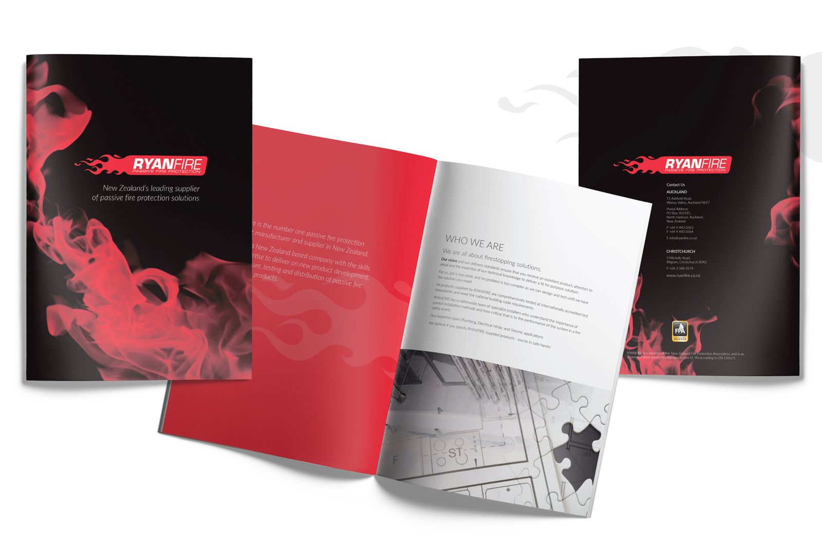
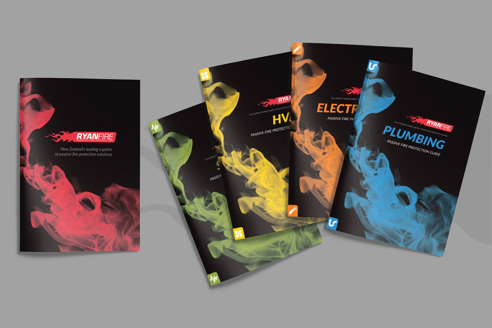
Ryanfire's brochures were clinical and hard to tell apart. Working with their existing logo, we gave each product offering its own colour and identity, and built a series reps can hand over in a folder, or clients can read online.
The pages
Clear, calm, and impossible to confuse.
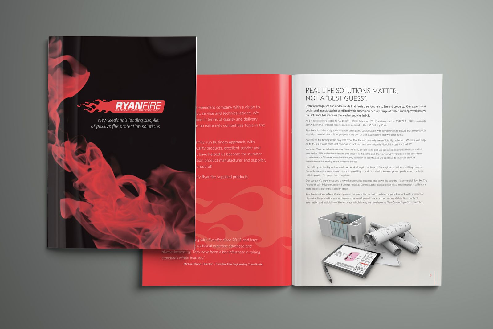
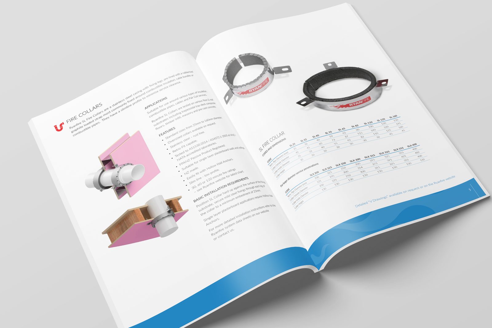
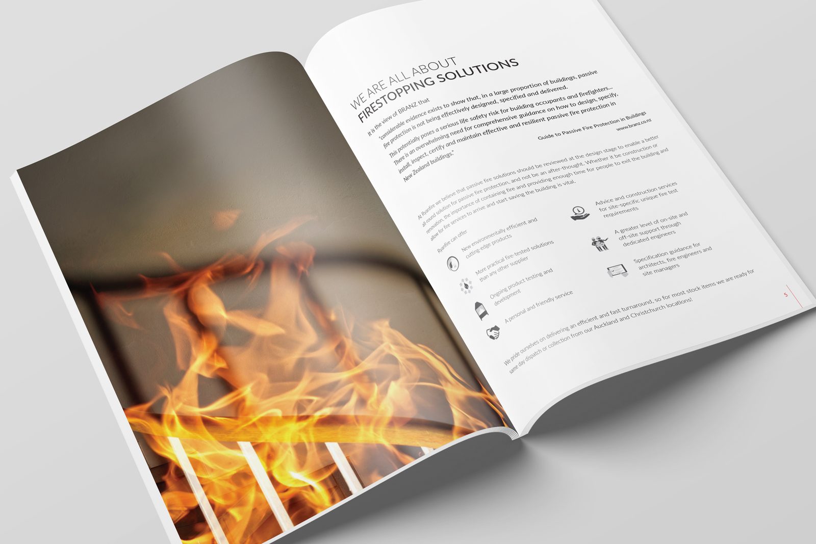
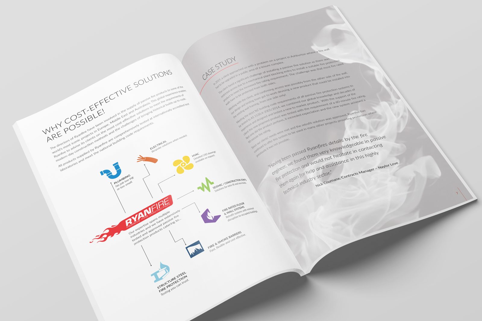
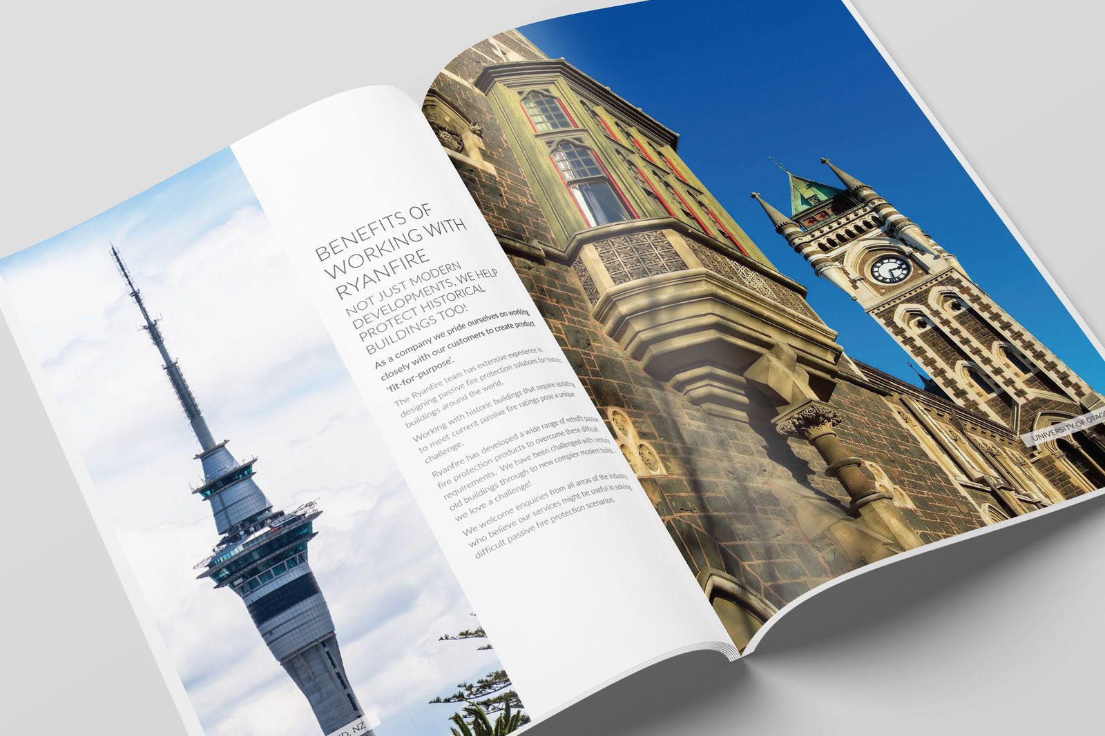
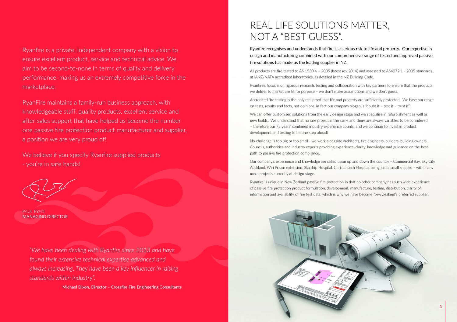
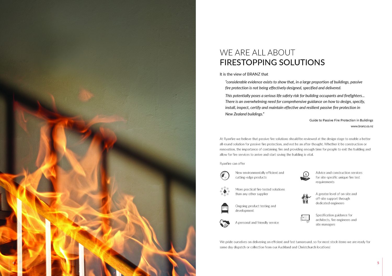
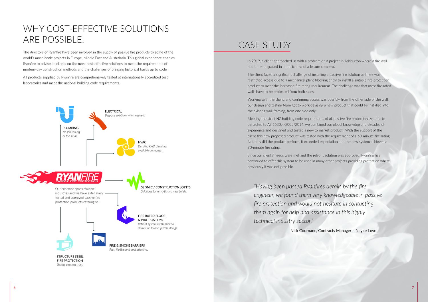
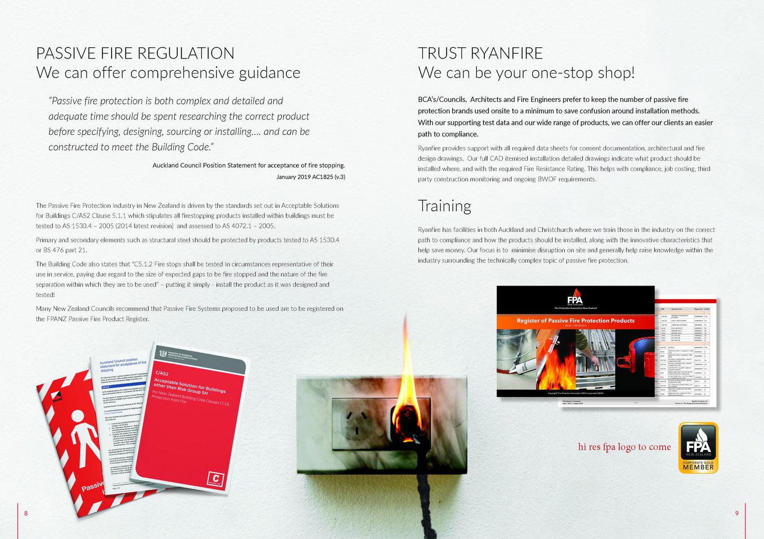
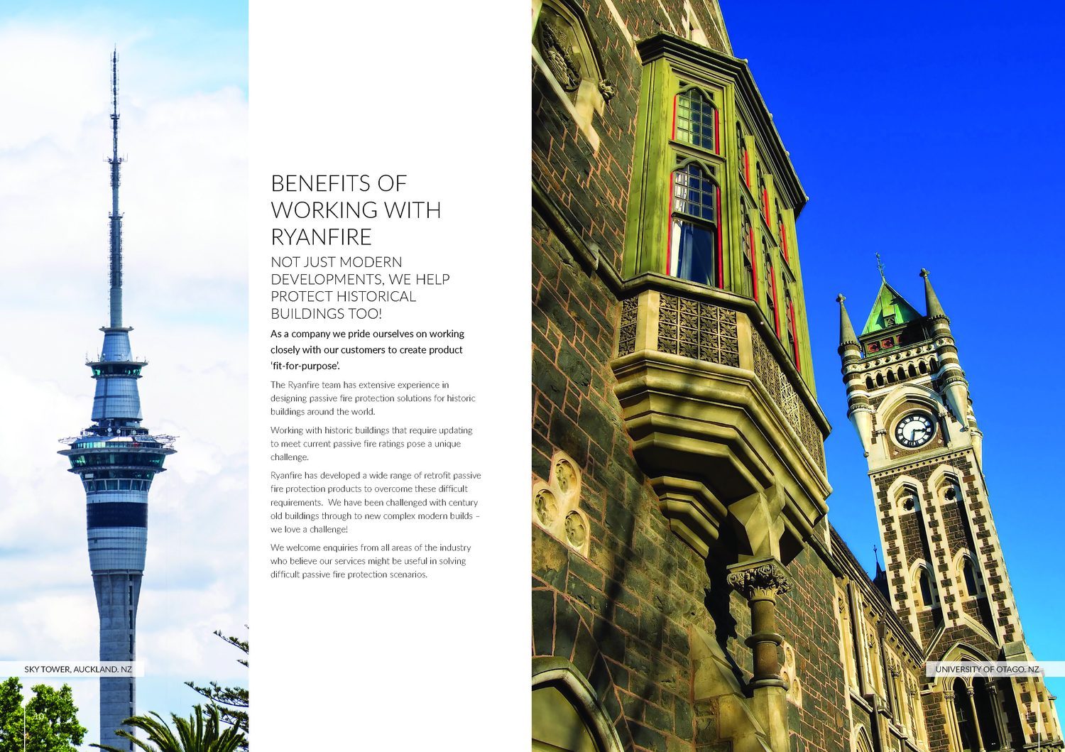
Red leads the main brochure. Open spreads keep technical content easy to scan, with generous white space and strong photography.
The brief
Life and property safety, made approachable.
Ryanfire is a passive fire protection provider with a deep technical range. We scoped the job at Creative Edge Marketing, worked with the logo they already had, and set out to lift very clinical brochures with some vibrancy.
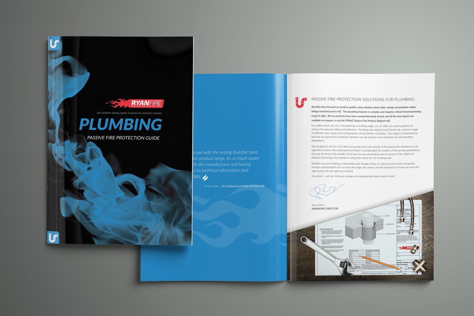
The answer was a family: one master brochure, then a guide for each product offering, each with its own colour, icon and smoke imagery so the right guide is easy to spot at a glance.
The series
One family, five colours.
Each product offering takes a colour and an icon, carried through the cover, the spreads, the tables and the tabs.
In the hand
Made to be handed over.
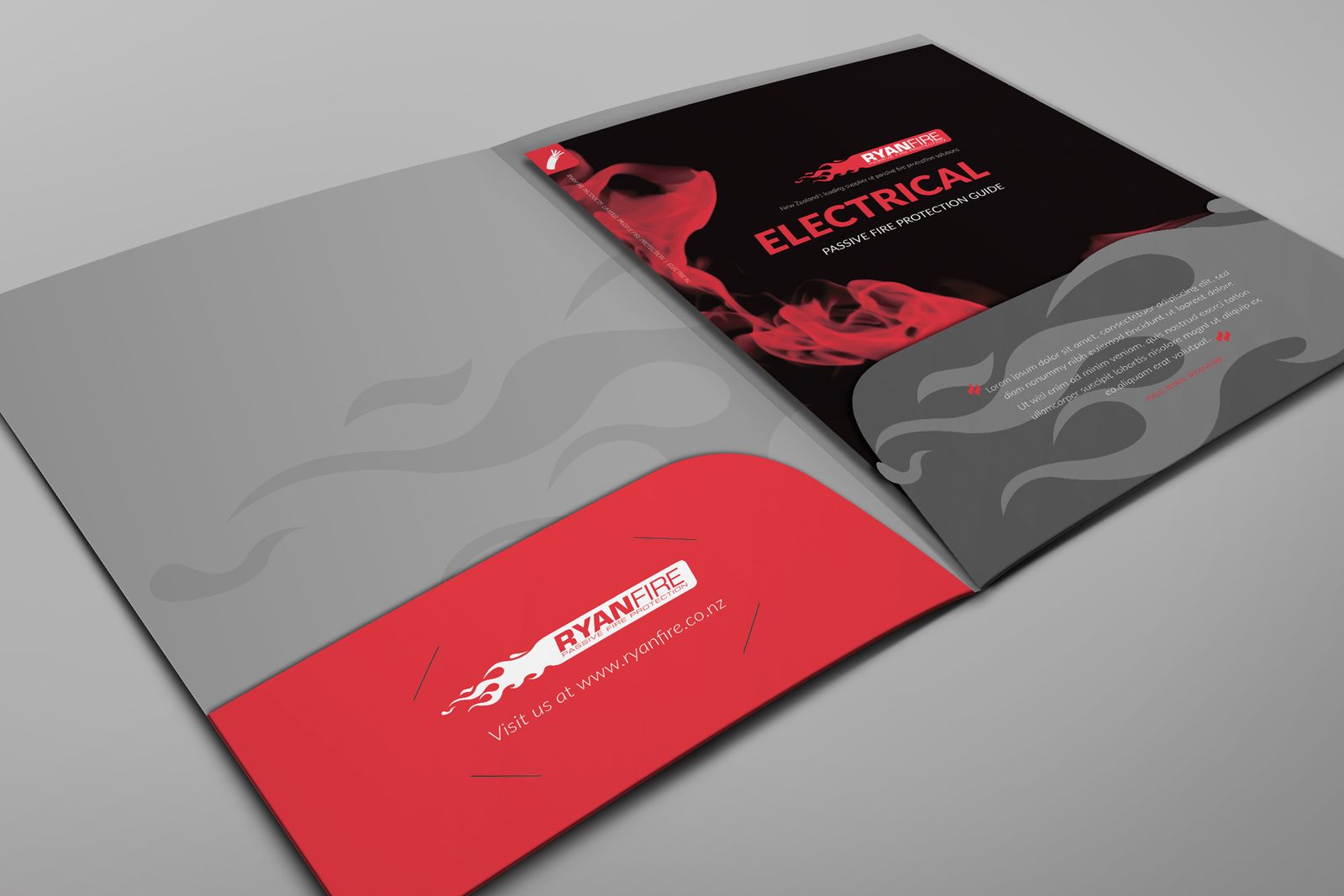
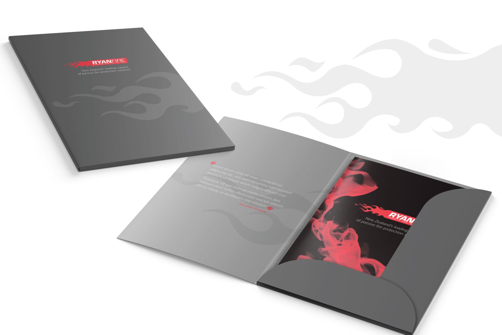
Printed guides sit in a branded presentation folder, so a rep can build a pack for each client and leave them with just the products they need.